
This page outlines the appropriate usage of the pre-defined styles in the RTE. For a full visual guide of the appearance of each of these items see Style Appearance Cheatsheet.
Text Styles
Headings
You can apply H2-H6 elements and 5 corresponding styles.
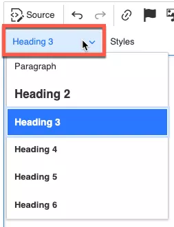
You can differentiate paragraphs and headings using the headings dropdown. Headings must be used in a hierarchical syntactical fashion and not used to achieve a specific appearance. When used correctly this will improve search engine results and will make your pages more accessible. See Accessible Text, Headings and Documentation for more information proper heading usage.
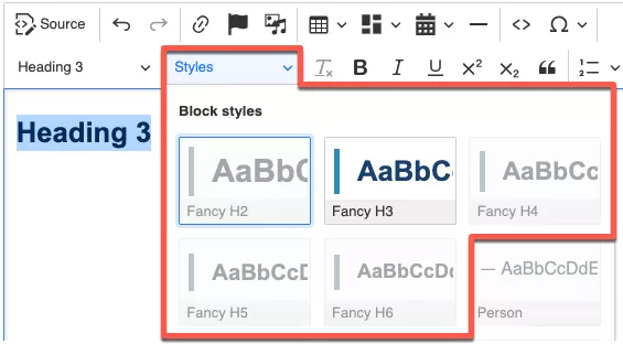
The following styles apply to headings of the appropriate type:
- Fancy H2
- Fancy H3
- Fancy H4
- Fancy H5
- Fancy H6
Paragraphs
The following styles apply to paragraphs:
- Featured Text
- This is intended to be used when you wish to draw attention to a specific block of text.
- Center text
- This style centres the paragraph.
- Red
- This style can be used to draw attention to a specific text. Use sparingly and meaningfully.
-
- Strictly for use with block quotes to acknowledge the individual being quoted.
List Styles
Numbered List Styles (Ordered Lists)
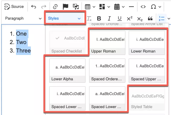
The following styles apply to ordered lists:
-
Upper Roman
-
This style allows you to use uppercase Roman numerals for your numbered list (I, II, III, IV, V, etc.).
-
-
Lower Roman
-
This style allows you to use lowercase Roman numerals for your numbered list (i, ii, iii, iv, v, etc.).
-
-
Lower Alpha
-
This style allows you to use lowercase alphabet characters for your numbered list (a, b, c, d, e, etc.).
-
-
Spaced Ordered Default
-
This is the same as the default numbered list but it places additional spacing between list items.
-
-
Spaced Upper Roman
-
This is the same as the Upper Roman style but it places additional spacing between list items.
-
-
Spaced Lower Roman
-
This is the same as the Lower Roman style but it places additional spacing between list items.
-
-
Spaced Lower Alpha
-
This is the same as the Lower Alpha style but it places additional spacing between list items.
-
Bulletted List Styles (Unordered Lists)
The following styles apply to unordered lists:
-
Arrow List
-
This style changes the display of the bullet points into triangular arrows.
-
-
Checklist
-
This style changes the display of the bullet points into checkmarks.
-
-
Spaced Unordered Default
-
This style is the same as the default bulleted list but places additional spacing between list items.
-
-
Spaced Arrow List
-
This style is the same as the Arrow List style but places additional spacing between list items.
-
-
Spaced Checklist
-
This style is the same as the Checklist style but places additional spacing between list items.
-
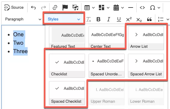
Table Styles
Styles applied to the whole table
The following styles apply to tables:
-
Styled Table
-
This style is used to apply formatting to your table cells. Additionally it adds padding to the table cells and displays the table headers in a different colour to better distinguish them. This should be used for all data tables where possible Ensure you specify the header row of the table.
-
-
Styled Center Table
-
This style is identical to Styled Table but it also centers the table in your content with equal spacing to either side. Ensure you specify the header row of the table.
-
Styles applied to elements within the table
This applies the td:
-
Centered Cell
-
This aligns the text in the cell to be centered vertically and horizontally.
-
-
Centered Top Cell
-
This aligns the text in the cell to be centered horizontally and anchors the text to the top of the cell. This is useful when you have one cell that causes the row to become very tall.
-
-
Top Aligned Cell
-
This anchors text to the top of a cell but leaves it left-aligned. This is useful when you have one cell that causes a row to become very tall.
-