

U of T's visual identity plays a vital role in gaining recognition within our community and on a global scale. By adhering to our visual brand identity guidelines, everyone representing the university can create visually engaging, consistent and impactful materials.
To learn more about the U of T signature, visit the U of T Brand Portal.
U of T Brand Portal
U of T Mississauga signature
While U of T’s signature is a kind of logo, we refer to it consistently as a signature to distinguish it from the Defy Gravity logo.

Both the University of Toronto Mississauga and the University of Toronto Scarborough have their own signatures that contain (1) the coat of arms, (2) the University of Toronto wordmark, (3) a divider line and (4) their respective campus name. Each campus should use its assigned signature.
Signature usage
It's critical that all faculties, departments and extra departmental units (EDUs) use their designated signatures as outlined on the Brand Portal. Consistent use of your signature across all communications helps to maintain and strengthen brand recognition on a local and global scale. Do not alter or manipulate the signature artwork files in any way; this includes adding and removing elements, resizing elements independently, changing the colour, etc.
The university must approve the use of U of T signatures before public use. Approved use of a U of T signature is limited to the single application you requested permission for. Visit our signature assets page to request access.
Use the U of T signature in all communications, with some exceptions. For consultation on using the signature in the context of your faculty or college, please contact Brand Hub.
Signature colour

The signature’s primary colour is U of T Blue (Pantone® 655).
- PMS 655 CP
- CMYK: 100, 79, 12, 59
- RGB: 30, 55, 101
- HEX: #1E3765
U of T Blue signature on image

You can place the colour signature over an image, provided it doesn’t compromise the visibility or integrity of the signature in any way.
Reverse signature on colour

We recommend using the reverse signature (the signature in white) when placed on a dark background. Ensure you are selecting the signature with the beaver and books in white.
Reverse signature on image

We also recommend using the reverse signature (the signature in white) on busy backgrounds such as a photograph or textural image. When placing the signature over images, ensure the visibility and integrity of the signature is not compromised.
In the examples above, we use the UTM signature. These guidelines apply to all campus, faculty, department and EDU signatures.
Signature clear space

The University of Toronto Mississauga signature must have space around it to ensure it is never too close to other graphic elements or the edge of your design.
The minimum clear space (padding) around the U of T signature is equal to 50 per cent of the height of the coat of arms on all four sides.
Minimum signature size

The University of Toronto coat of arms includes many intricate details and thin lines.
To protect the coat of arms’s integrity and guarantee legibility and clarity, the minimum width of the coat of arms within the signature is 0.25".
In applications where the imprint area is severely limited, or where the method of reproduction will compromise the clarity and integrity of the coat of arms, we recommend using the wordmark only.
Improper signature usage

Don't add additional text to the signature.

Don't stretch or extend the signature.

Don't use a colour other than U of T Blue.

Don't use the signature without the coat of arms (merchandise exempted).

Don't rearrange the elements of the signature.

Don't resize elements independent of the signature.
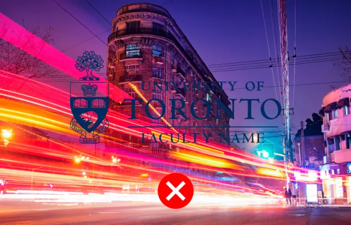
Don't place the signature on a busy image or background.
Don't use the coat of arms on its own without consulting the Brand Hub.

Don't recreate the reverse signature (the beaver and the books must appear as white).

Don't use two signatures on the same document.
Signature placement

University of Toronto signatures should always be displayed prominently and aligned to the left of the page whenever possible.
If you cannot align to the left, right alignment is the acceptable alternative.
You can use the centred signature when other elements in an application are centre aligned.
Simplified U of T signature
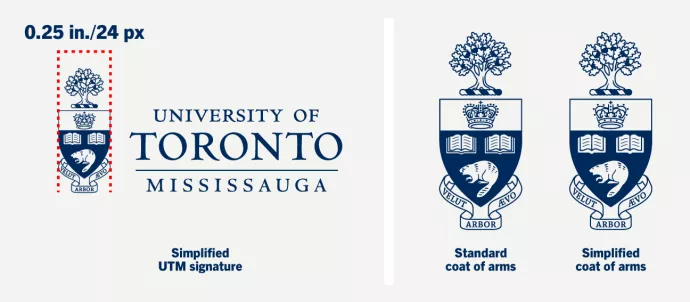
The simplified signature ensures legible reproduction when the coat of arms is smaller than 0.25" wide.
If you create merchandise with limited print space, an even more simplified version of the signature is available. Please contact Trademark Licensing or Brand Hub.
The University of Toronto coat of arms includes many intricate details and thin lines. In the simplified version, we have reduced the line details within the oak leaves, crown, books and beaver.
Circular signature

The University of Toronto circular signature is available for limited use, such as certificates and merchandise. You should not use the circular signature in place of the university signature.
Circular signatures are available for UTM, UTSC and faculties with the recommended usage above.
The circular signatures are not available for download. To inquire about the use and/or request circular signature files, please contact Trademark Licensing.
Signature wordmark

You can use the wordmark in limited applications, including merchandise or when size or reproduction capabilities will compromise the coat of arms.
The wordmark is not available for download. Please contact Trademark Licensing or Brand Hub to inquire about using the wordmark.