

To learn more about signature and text lock-ups, please visit the U of T signature and text lock-ups page.
U of T signature and text lock-ups page
A text lock-up is a combination of a U of T signature and another element, such as the name of an office, unit or initiative. The signature and text appear side by side to identify communications from specific areas within the university.
In this section, you'll learn about our signature and text lock-ups and when and how to apply them across various communications and media.
Signature and text lock-ups are created by Brand Hub, and you should not create your own.
To request a signature and text lock-up, please contact Brand Hub.
Elements of text lock-up
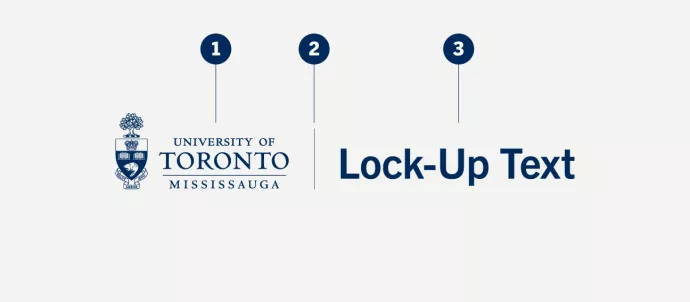
Signature and text lock-ups pair a U of T signature with additional text (an office or initiative name, for example), which always appears in U of T Blue, the university's primary colour and Trade Gothic, one of the official typefaces of the university. (1) The university signature, comprising our coat of arms and wordmark. (2) A vertical line, visually separating but graphically uniting the signature and text. (3) The unit name, set in Trade Gothic, in U of T Blue (PMS 655).
When to use text lock-up
In most cases, the U of T signature remains the preferred visual identifier for public-facing communications.
Some offices, units or initiatives may use their signature and text lock-ups in place of the university signature to identify themselves in specific materials, such as:
Websites
You can incorporate a signature and text lock-up in the header of a website to help your audience identify your office or unit.
Digital newsletters and marketing emails
You can include your office or unit signature and text lock-up at the top of your e-newsletter or marketing email.
Print applications
When you want to ensure your audience (most often internal) knows a communication is coming from a specific office or unit, replace the university signature with your signature and text lock-up.
When not to use text lock-up
In most cases, you should not use a signature and text lock-up in place of the university signature. Only use signature and text lock-ups when identifying your office or unit is strategically important.
Signature and text lock-ups should not appear in the following examples:
Stationery
Signature and text lock-ups do not appear on official university stationery. Instead, we include the office or unit name in letterhead footers and the department information section on business cards.
Recognition
Do not use your signature and text lock-up when recognizing U of T as a partner, sponsor, client, etc.; instead, use the university signature.
Email signatures
Personal emails differ from e-newsletters and marketing emails and should not contain signature and text lock-ups. Instead, continue to use one of the approved email signatures available here.
Example: The President’s Office uses its signature and text lock-up at the top of its website only. All other marketing and communications materials use the university signature.
Text lock-up configurations
Single-line text lock-up.

Double-line text lock-up.

Double-line text lock-up with hierarchy.

Triple-line text lock-up.
Text lock-up colour
Text lock-up colour
The signature and text lock-up's primary colour is U of T Blue (Pantone® 655).

Reverse text lock-up on colour
We recommend using the reverse signature and text lock-up (the signature and text lock-up in white) on dark backgrounds. Ensure you select the signature with the beaver and books in white.

U of T Blue text lock-up on image
You can place the signature and text lock-up over an image, provided it doesn’t compromise the visibility or integrity of the signature in any way.

Reverse text lock-up on image
We also recommend using the reverse signature and text lock-up (the signature and text lock-up in white) on busy backgrounds, such as photographs or textural images. When placing the signature over images, ensure you don’t compromise the visibility and integrity of the signature.
Text lock-up clear space
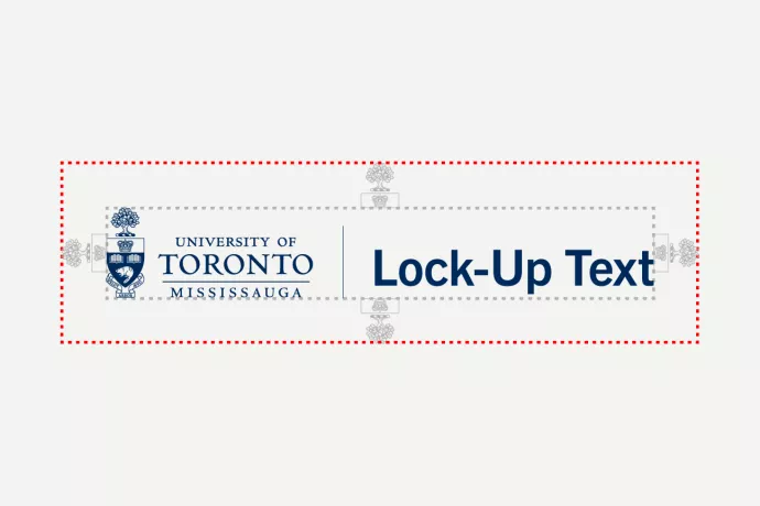
All U of T logos, including signature and text lock-ups, require clear space around them to ensure they are not placed too close to edges, other logos and/or graphic elements.
Minimum text lock-up size

To protect its integrity and guarantee legibility and clarity, the coat of arms must be at least 0.25" or 24 pixels within signature and text lock-ups.
Improper text lock-up usage

Don't stretch the text lock-up.

Don't compress the text lock-up.

Don't use colours other than those assigned.

Don't rearrange elements of the text lock-up.

Don't resize parts of the text lock-up.

Don't place the text lock-up on a busy image or background.

Don't use the signature and text lock-up with another signature.
Only use the approved artwork files.
Text lock-up placement
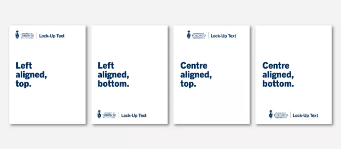
Here are some examples of preferred locations for signature and text lock-ups in print applications (where appropriate – learn more in the examples above).
Like the university signature, signature and text lock-ups should always be displayed prominently and aligned to the left of the page whenever possible.
If you cannot align to the left, right alignment is the acceptable alternative.
You can use the centred signature when other elements in an application are centre-aligned.
Please refrain from using signature and text lock-ups as document titles. They are meant to be used as brand identifiers, as shown above.