In Fall 2019 and Winter 2020, the Peel Social Lab surveyed students enrolled in our Introduction to Sociology course (SOC100H5) for insight on the UTM student experience, in particular perceptions of the treatment of people with disabilities (on and off campus), moral perception and behavior, and self-reflective cognition.
- View codebook
- Download Excel (.xlsx) data file
- Download Stata (.dta) data file
- Data Highlights
- Figures
Data Highlights
- Demographics of respondents and their caregivers
- 32% of students surveyed were currently working for pay, with 22% of working respondents working 20 or more hours a week
- Students surveyed were most likely to identify as women (65%), Canadian-born (55%), and South Asian (26%)
- Most respondents lived in Mississauga (60%), and 74% of those in Mississauga lived off campus
- Respondents were most likely to report having “no religion” (27%)
- Of those with religious affiliation, Islam was the most common (21%), followed by Roman Catholicism (20%)
- When asked about their caregivers, 82-83% of the first two caregivers respondents identified were foreign-born, and 39% of them had at least a Bachelors degree (or equivalent)
- Health and wellbeing
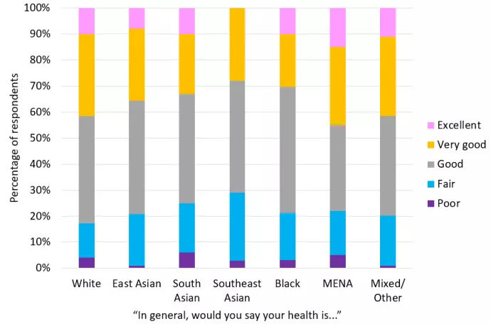
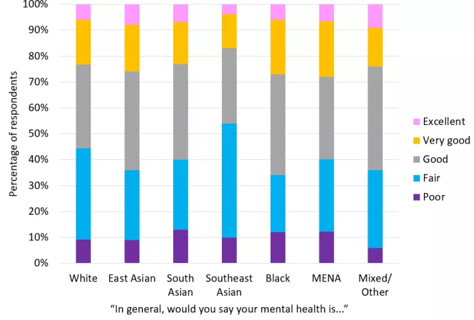
- 79% of respondents rated their health as at least “good”, but much less (although still a majority) rated their mental health as at least “good” (60%)
- Around a third reported often feeling “helpless” dealing with life problems (30%) or “pushed around in life” (37%)
- Academic Background and Career Plans
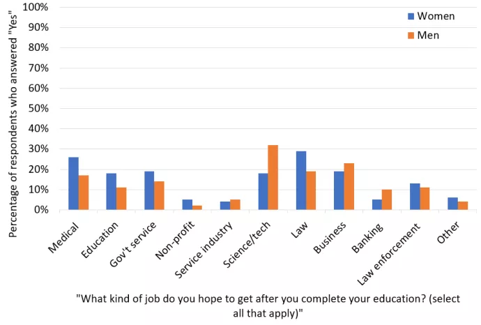
- Respondents were most likely to report interest in working in the fields of law (25%), medicine (23%), and science/technology (23%)
- 20% report wanting to start their own business
- Disability
- 21% of respondents believe that people with disabilities are discriminated against in school, and 43% are unsure
- 91% believe that people with disabilities are “sometimes” or “often” discriminated against when looking for a job
- 85% disagree that accommodations made through Accessibility on campus are “a burden to faculty and unfair to other students”
- Morality
- When asked about what considerations are relevant to them when deciding “whether something is right or wrong”, the highest-rated consideration was “Whether or not someone was denied his or her rights”
- When asked about the extent to which several values-related statements are relatable to them, the average highest-rated statements were “I think it is important that every person in the world be treated equally. I believe everyone should have equal opportunities in life” and “It's very important to me to help the people around me. I want to care for their well-being”. The average lowest-rated statement was “I believe that people should do what they're told. I think people should follow rules at all times, even when no-one is watching”.
Figures
Figure 1. Percentage of men and women who hope to get jobs in various industries after completing their education.

|
|
Medical (%) |
Education (%) |
Government service (%) |
Non-profit (%) |
Service industry (%) |
Science / tech (%) |
Law (%) |
Business (%) |
Banking (%) |
Law enforce-ment (%) |
Other (%) |
|---|---|---|---|---|---|---|---|---|---|---|---|
|
Women |
26 |
18 |
19 |
5 |
4 |
18 |
29 |
19 |
5 |
13 |
6 |
|
Men |
17 |
11 |
14 |
2 |
5 |
32 |
19 |
23 |
10 |
11 |
4 |
Figure 1 is a clustered column chart. It presents responses to the question “What kind of job do you hope to get after you complete your education?”, as noted in the title of the horizontal axis. Respondents could select multiple answers. The horizonal axis presents eleven answers: 1) medical; 2) education; 3) government service; 4) non-profit; 5) service industry; 6) science/technology; 7) law; 8) business; 9) banking; 10) law enforcement; 11) other. The vertical axis shows percentages from 0% to 100%. The legend shows that the results are divided into two categories, each with a differently coloured column: 1) women (blue columns); 2) men (orange). The columns represent the percentage of respondents in each category who responded “Yes” to any of those answers. Therefore, the eleven sets of columns represent eleven different variables, and totaling the different answers may not add up to 100%. The table below the chart presents the same information.
Figure 2. Self-rated health of students from different racial or ethnic groups.

|
|
White |
East Asian |
South Asian |
Southeast Asian |
Black |
Middle Eastern, |
Mixed / Other |
|---|---|---|---|---|---|---|---|
|
Excellent (%) |
10 |
8 |
10 |
0 |
10 |
15 |
11 |
|
Very good (%) |
31 |
28 |
23 |
28 |
20 |
30 |
30 |
|
Good (%) |
41 |
44 |
42 |
43 |
48 |
33 |
38 |
|
Fair (%) |
13 |
20 |
19 |
26 |
18 |
17 |
19 |
|
Poor (%) |
4 |
1 |
6 |
3 |
3 |
5 |
1 |
Figure 2 is a 100% stacked column chart. This means that, visually, there is one column for each category (in this case, racial/ethnic groups), and the column internally is divided into five colours (corresponding to the percentage that selected each answer in the self-rated health scale), totalling 100% of the answers for each racial group. When comparing this visual representation to the data table below, which presents the same results, the answers in the data table may not add up to 100%, due to rounding. This chart presents responses to the question “In general, would you say your health is…” as noted in the title of the horizontal axis. The horizonal axis presents seven racial or ethnic categories: 1) White; 2) East Asian; 3) South Asian; 4) Southeast Asian; 5) Black; 6) Middle Eastern or North African; 7) Mixed race or other. The vertical axis shows percentages from 0% to 100%. The legend shows that the results for each racial/ethnic group are divided into five possible answers, each with a different colour: 1) excellent (pink); 2) very good (yellow); 3) good (grey); 4) fair (blue); 5) poor (purple). Each column represents 100% of the respondents from that racial/ethnic group, and each colour within a column represents the percentage of those respondents who selected one of the five answers. The table below the chart presents the same information.
Figure 3. Self-rated mental health of students from different racial or ethnic groups.

|
|
White |
East Asian |
South Asian |
Southeast Asian |
Black |
Middle Eastern, |
Mixed / Other |
|---|---|---|---|---|---|---|---|
|
Excellent (%) |
6 |
8 |
7 |
4 |
6 |
7 |
9 |
|
Very good (%) |
17 |
18 |
16 |
13 |
21 |
23 |
15 |
|
Good (%) |
32 |
38 |
37 |
29 |
39 |
34 |
40 |
|
Fair (%) |
35 |
27 |
27 |
44 |
22 |
30 |
30 |
|
Poor (%) |
9 |
9 |
13 |
10 |
12 |
13 |
6 |
Figure 3 is a 100% stacked vertical/column graph. This means that, visually, there is one column for each category (in this case, racial/ethnic groups), and the column internally is divided into five colours (corresponding to the percentage that selected each answer in the self-rated mental health scale), totalling 100% of the answers for each racial group. When comparing this visual representation to the data table below, which presents the same results, the answers in the data table may not add up to 100%, due to rounding. This chart presents responses to the question “In general, would you say your mental health is…” as noted in the title of the horizontal axis. The horizonal axis presents seven racial or ethnic categories: 1) White; 2) East Asian; 3) South Asian; 4) Southeast Asian; 5) Black; 6) Middle Eastern or North African; 7) Mixed race or other. The vertical axis shows percentages from 0% to 100%. The legend shows that the results for each racial/ethnic group are divided into five possible answers, each with a different colour: 1) excellent (pink); 2) very good (yellow); 3) good (grey); 4) fair (blue); 5) poor (purple). Each column represents 100% of the respondents from that racial/ethnic group, and each colour within a column represents the percentage of those respondents who selected one of the five answers. The table below the chart presents the same information.
